- XRP trading volume has increased slightly over the last 24 hours.
- There has been a fight between sellers and buyers recently.
As Ripple (XRP) struggled earlier this week, there was a noticeable shift in market sentiment, with more traders taking short positions on XRP.
This change is reflected in one of XRP’s key derivatives indicators, which suggests increased bearish sentiment among traders.
XRP’s mood changes
AMBCrypto analyzed Ripple funding rates on Coinglass, reflecting significant changes in market dynamics.
XRP’s weighted funding rate, which was around 0.0097% on July 7, has dropped noticeably, dropping below 0 throughout the day and stabilizing at -0.0046% at the time of writing.
A change in the funding ratio from positive to negative indicates a shift from buyer-led to seller-led.
Essentially, a negative funding rate suggests that short sellers are willing to pay a premium to hold their positions, and therefore expect the XRP price to continue to decline.

Source: Coinglass
Additionally, this trend of increasing short positions indicates that trader sentiment has turned bearish on XRP. It also shows that more traders are betting against a short-term price recovery.
Is recovery underway?
AMBCrypto took a look at XRP on the daily and hourly charts to gain insight into why so many traders have taken short positions on the asset.
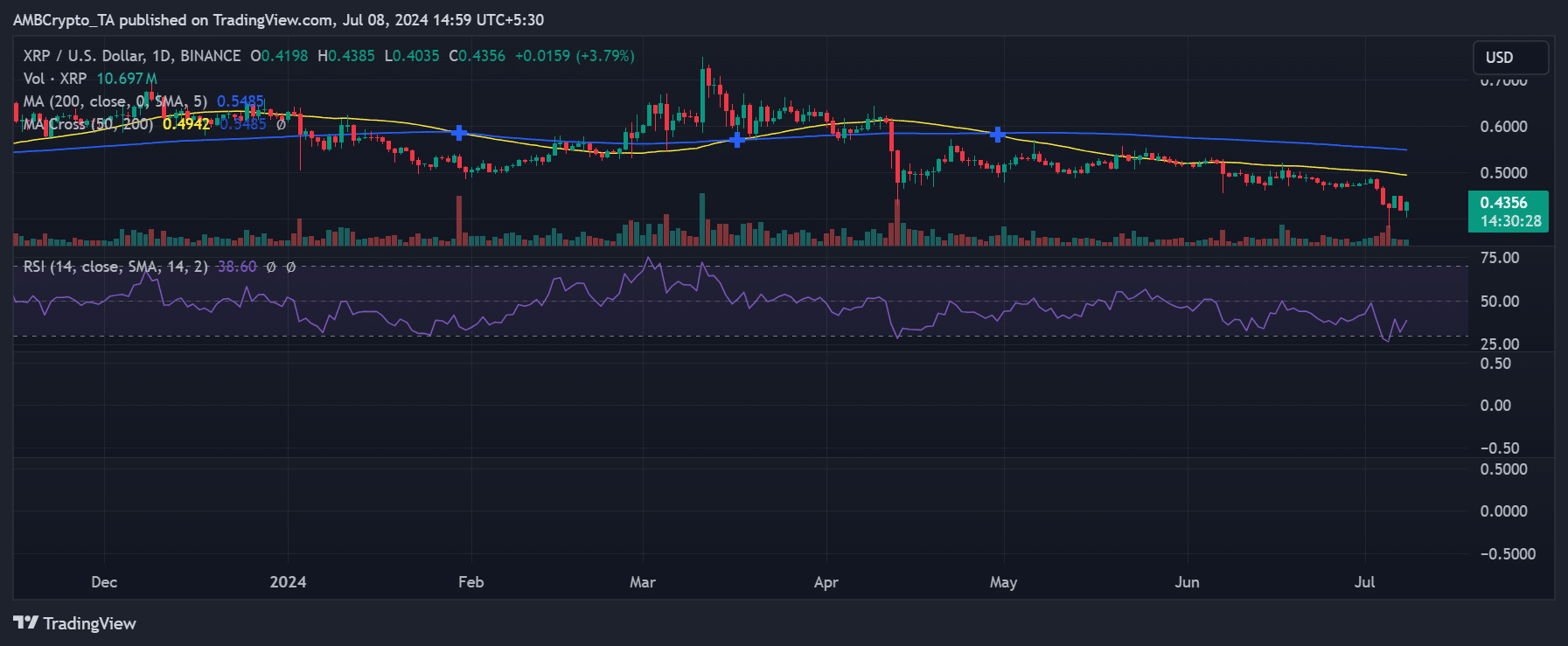
XRP started the week in a downtrend, but culminated in a significant decline. The chart showed a 6.65% drop at the end of trading on July 7, with the price dropping to around $0.41.


Source: TradingView
At the time of writing, XRP is showing some recovery, trading around $0.43, up more than 3%.
This bounce has raised questions about the sustainability of recent price gains. Given the volatility and recent short selling trends, traders and investors may be cautious.
XRP is stuck in a downtrend.
XRP has further highlighted the asset’s strong downtrend on the daily time frame chart, which is highlighted by the Relative Strength Index (RSI).
At the time of writing, XRP’s RSI was below 40, indicating bearish momentum and suggesting the asset may be under significant selling pressure.
Additionally, the moving averages on the chart (often shown as yellow and blue lines) have been trending higher than the price at the time of writing.
Realistic or not, here is XRP market cap in BTC terms.
This configuration typically indicates a bearish market situation, with the moving averages acting as resistance levels that could hinder any potential price recovery.
The fact that these averages are above price reinforces the idea that a downtrend is strong.

